Metro

Utilising the services of a variety of public transport providers, curated by Environment Canterbury with input from the Christchurch City Council, Metro needed a unified brand identity to take their key messaging into the public arena.
Question: how do you get so many decision-makers from various organisations to agree on a single-minded way forward?


Our first step was to gather key people from all organisations for an intensive brand discovery session. Together, we unravelled the current brand and then put it back together piece by piece, noting down many of our findings as we went.
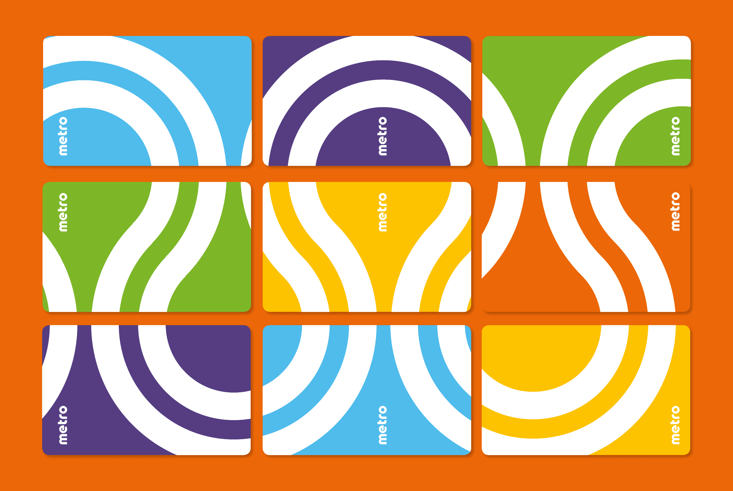
These findings formed the foundations of our new brand framework. Next, we output key messaging, a unique brand personality and aesthetic, as well as a brand guideline document. The new brand lockup was inspired by the grids and squares of Christchurch, and the artwork of Mondrian.
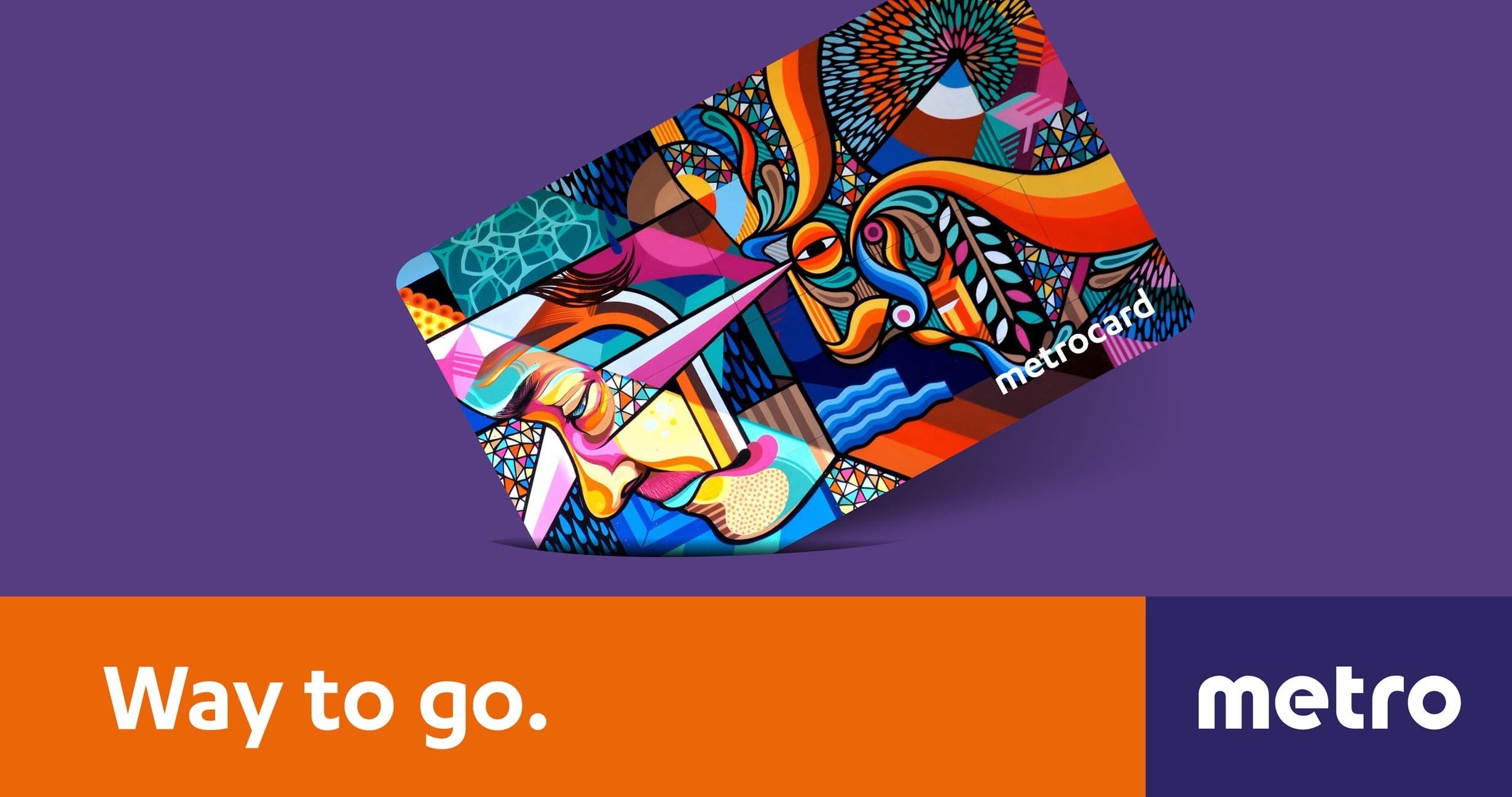
The Unique Value Proposition was ‘Way to go’. As in, public transport is the future of people moving. It’s better for our city. It’s safer. And also it’s affirming statement for those who already use the Metro service as in ‘Way to go, mate!’
Public transport is shedding its ‘loser cruiser’ status. By adopting a modern colourful brand lock up, and encouraging people to make a difference, Metro has become a strong voice for change.
Key decision-makers have embraced the brand, which has rolled out citywide. Bus user numbers are on the rise, and the positive Metro brand messaging is helping these numbers to grow even more.


